There Is Light at the End of the Tunnel, Yes. But it’s a Long Tunnel

Otello Stampacchia, founder, Omega Funds
I will start with the good news.
The good news
As of this writing, on Dec. 19, the FDA has just granted ModeRNA an Emergency Use Authorization (EUA) for a coronavirus vaccine. We now have two vaccines available, based on essentially the same mRNA-based technology, including the one from Pfizer/BioNTech that received an EUA earlier this month.
It’s worth stating that both ModeRNA and BioNTech (the company that originated the vaccine developed by Pfizer) are led by immigrants. Think about that when you want to close borders and stop immigration, perhaps?
Before I move on to more depressing topics, it is important to reflect and rejoice on just how *amazing* this feat of science is. The coronavirus genetic sequence was made available in January. In less than 11 months, we have now two vaccines passing muster with regulators and being widely distributed.
The previous vaccine development record was for mumps, developed in roughly 4 years and approved in 1967. We are witnessing a scientific revolution unparalleled, in its breadth and depth and in my (very) biased opinion, since the end of the Renaissance.
This truly is biology’s century.
Amazement should not stop at the speed of these vaccines’ development. They are (both) incredibly effective, certainly beyond my (perhaps pessimistic) expectations of a 60-70% efficacy range. In clinical trials with tens of thousands of individuals, both vaccines achieved >94% efficacy rates in protecting against infection, and resulted in *no severe symptoms in people who became infected*.
Importantly, they were both effective for different races / genders, and for individuals in high-risk populations (including the elderly, and people with underlying medical conditions). Side effects reported from the clinical trials were generally mild and temporary (more on this later). In summary, these two vaccines were not only developed in record time – they rank among the very best of all vaccines in terms of efficacy.
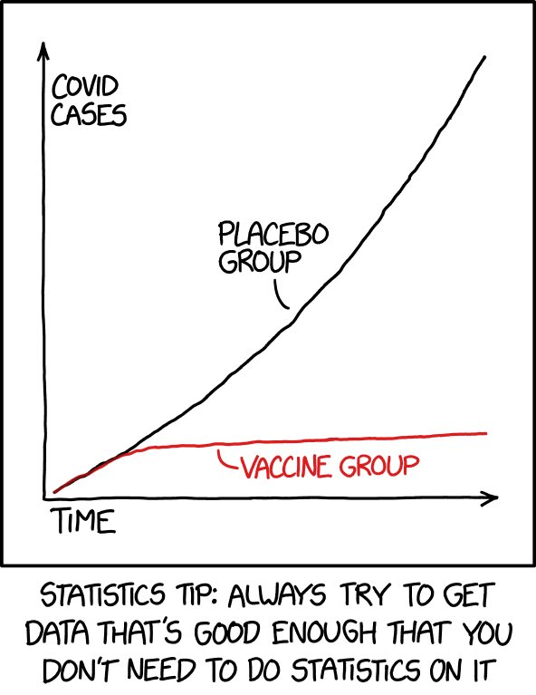
As highlighted by this graph (from @xkcd’s Randall Munroe: one of the best / funniest comic illustrators of scientific / statistical topics): the data are so clear and compelling that we don’t need to do statistics on it (fear not, I will bother you with statistics in a bit)…
You know the expression “don’t shoot the messenger”? I say shoot it (the messenger RNA!) straight into my arm as soon as it is feasible to administer it to the (relatively) lower risk population I belong to!
Did I manage to make you feel good (nay: great!) about science? Fabulous.
Now let me make you feel bad about human beings and our behavioral fallacies.
The Bad News: This Tunnel is a Lot Longer and Darker Than You Think
If you are up-to-date with the latest coronavirus pandemic news, I suggest you skip this part. That said, I highly recommend you read it if you are planning large family (or any type of) gatherings with people outside your immediate, close family “bubble” around the upcoming holidays.
As published in JAMA (Journal of the American Medical Association) on Dec. 17, COVID-19 is now the leading cause of death in the United States. As JAMA horrifyingly and clearly says, “The daily US mortality rate for COVID-19… is equivalent to the September 11, 2001, attacks, which claimed ~3,000 lives, occurring every 1.5 days, or 15 Airbus 320 jetliners, each carrying 150 passengers, crashing every day”.
Let me repeat that: *15 full planes crashing every day*.
This country has gone to (many) wars for a lot less:
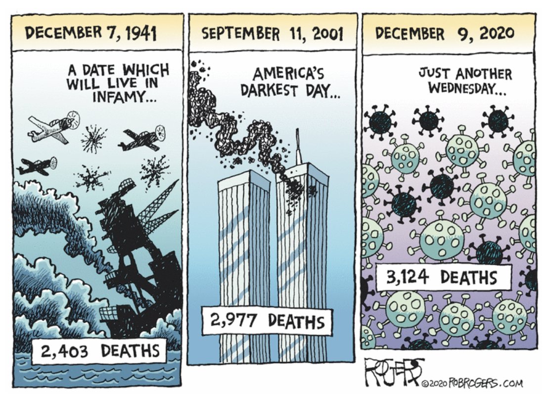
(Graph above by Rob Rogers, award-winning, nationally syndicated editorial cartoonist formerly with the Pittsburgh Post-Gazette: follow him at @Rob_Rogers).
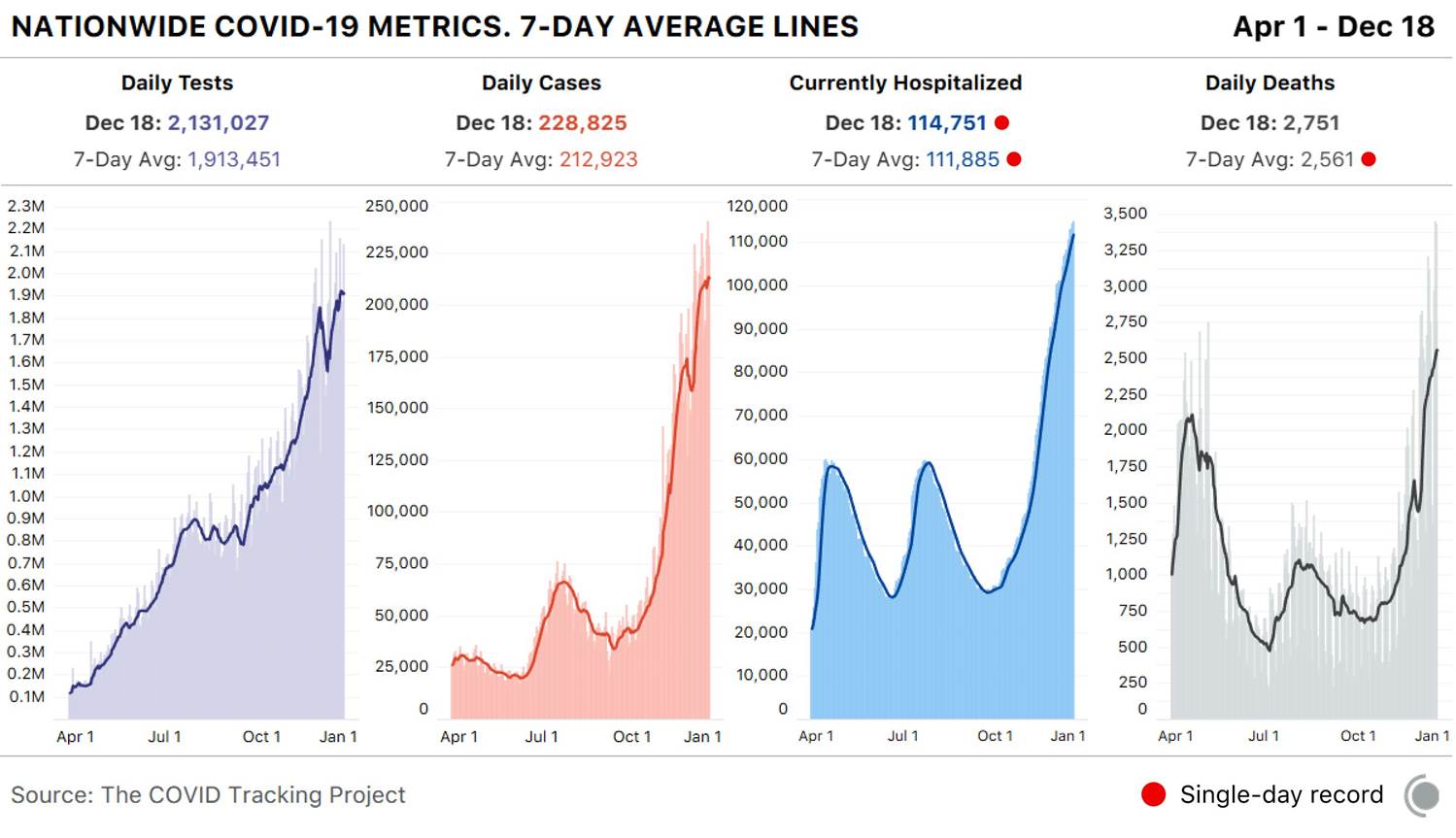
And there is no immediate end in sight to the carnage. The graph below, from The COVID Tracking Project (@COVID19Tracking) makes this abundantly clear. We have been breaking hospitalization records across the country, day after day, for close to two months.
The graph to the right should be horrifying indeed: as predicted in my Aug. 31 Timmerman Report article, we are exceeding, and will sadly continue to exceed, peaks in deaths reached during the April phase of the pandemic, when we were unprepared and scientists knew much less about the virus and how it’s transmitted.
What is our excuse now? Did we really think this virus was going to magically disappear? If so, shame on us (well, I am not sure that should be on me, TBH, but I wanted to “participate” in the collective shaming of our behavioral fallacies).
As a country, we are collectively failing the “marshmallow test”. For those of you who are not into behavioral theories, the “marshmallow test” was a study on *delayed gratification* led by Walter Mischel (from Stanford) in 1972.
In the test, a child is presented with the opportunity to receive an immediate reward or to wait to receive a better reward. A relationship was found between children’s ability to delay gratification during the test and their subsequent academic achievement. In follow-up studies, researchers were able to find a connection between ability to delay gratification with better life outcomes, as measured through quantifiable metrics such as SAT scores, educational attainment, and Body Mass Index (BMI).
These findings were made before the pandemic (unfortunately, like 71 million Americans, I have meaningfully increased my BMI this year. I blame the alcohol.)
So, again and again, with our collective shortsightedness, we traded short-term gains for what has truly been a painful fall / winter. We had summer at beaches and bars, then Thanksgiving gatherings, all while *knowing* this will result in many more people spending Christmas in the ICU.
US Thanksgiving travel broke pandemic era travel records, and resulted in the spike in cases, hospitalizations and deaths we are currently seeing (remember: reported cases lag hospitalizations by 2-4 weeks, and those lag fatalities by another 2-4 weeks). You can see those spikes in the graph above. The same will happen following Christmas gatherings.
How to Think About Risk
Warning: the segment below contains some discussion of statistics (trust me I will try to keep it simple).
The ”Swiss cheese” approach to protection and risk mitigation (adapted to the pandemic from earlier “Swiss cheese” description of risk by Australian virologist Ian MacKay: @MackayIM) has recently been discussed (even by the New York Times.) In my opinion, it has merit insofar as it illustrates how you can protect yourself from infection by layering “slices” of Swiss cheese (the real one is called Emmental, by the way, if you like cheese).
Each of the “cheese slices” has holes, i.e. is not perfect. Overall, though, combining them (social distancing, masks, hand-washing, air ventilation + humidity) significantly reduces the overall risk. Vaccination, when available, will add one more, (very) important protective layer.
The graph’s latest version (Ian has been working on versions of this for months, may the fates always be in his favor) organizes / segments the slices into “personal” vs “shared” responsibilities, and encourages people to think in terms of *all the slices* rather than any individual single layer being the most important. There is virtually no “zero risk” situation (unless you are living, like me, on top of a mountain for the time being).
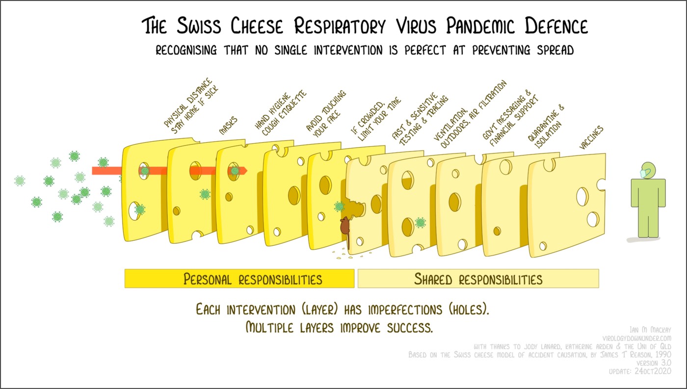
I would add the role of keeping indoor environments (whenever in contact with people who are not members of your household) not just adequately ventilated but also properly *humidified*: viral droplets appear to stay afloat much longer in dry, cold environments (I have spent a small fortune on humidifiers in the last months).
The graph is hopefully self-explanatory. However, those of you needing stronger glasses might not have noticed the cute, but incredibly dangerous “disinformation mouse” eating away at the protective layers. Just like the virus is “weaponized” and much more dangerous in indoor / wintry conditions, the sustained (coordinated??) misinformation campaigns running on social media are particularly dangerous when coupled to a lack of clear and consistent communication from public authorities.
You might remember some of these statements: “this is just like the flu”; “look at how well Sweden is doing and they are not crippling their economy”; “we are close to herd immunity”; “if we only let it rip, we will achieve herd immunity by the fall”; “this only kills old people, I want to go to the bar”.
Sadly, the list is quite a bit longer.
If you still believe in any of the bracketed statements above, please do me the courtesy to stop reading this silly piece of mine (and of never, ever speaking to me or any members of my family again, in case we used to be on speaking terms): you are entitled to your opinions, but you are not entitled to your own facts.
The disinformation mouse (I personally think it should be a rat, but the graph was not my idea!) is already starting to eat away at the potential enormous beneficial effects that rapid, at scale vaccination should bring.
(In)famously, and admittedly humorously, Brazilian President Bolsonaro railed on Dec. 17 against potential side effects from Pfizer’s vaccines saying “if you become an alligator, that is your problem.”
Intriguingly, as seen below in a portion of the FDA report on one of the vaccine trials, there can be serious events indeed happening after administration of the vaccine: a trial participant was struck by lightning 28 days after vaccination!
Talk about incredible side effects!
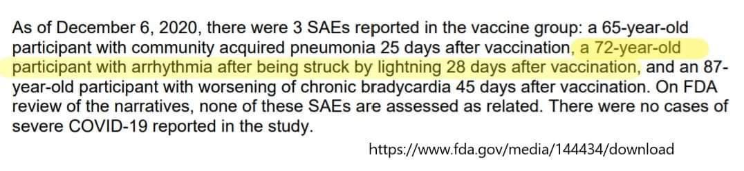
I hope you are not taking the above *too* seriously: serious events happening to clinical trial participants *are not necessarily side effects caused by the vaccine*! (I certainly hope lightning strikes are not…).
Just to give you a better sense of the fundamental difference between correlation and causation, I invite you to read one of Derek Lowe’s articles that dwells on the math here (the tile is, in itself, masterful: “Get Ready for False Side Effects”.
Quoting Bob Wachter’s great Twitter thread and Derek’s great article, “if you take 10 million people and just wave your hand back and forth over their upper arms, in the next two months you would expect to see about 4,000 heart attacks. About 4,000 strokes. Over 9,000 new diagnoses of cancer. And about 14,000 of that 10 million will die, out of usual all-cause mortality. No one would notice. That’s how many people die and get sick anyway.
But if you took those 10 million people and gave them a new vaccine instead, there’s a real danger that those heart attacks, cancer diagnoses, and deaths will be attributed to the vaccine. I mean, if you reach a large enough population, you are literally going to have cases where someone gets the vaccine and drops dead the next day (just as they would have if they *didn’t* get the vaccine).
In Conclusion
I would like to end with some (dark, obviously) attempt at humor. I watched, laughing and almost crying, the latest Saturday Night Live’s Weekend Update skit, with Dr. Wenowdis (the incomparable Kate McKinnon) on the COVID-19 vaccine.
“We didn’t do good. It could have been better. But it actually could not have been worse… we blow dys”. “It’s just like the light at the end of the tunnel has shown us how stinky and bad the tunnel is.”
Even the New York Times used the analogy (used by Colin Jost at the end of the same SNL skit above) that it is “always darkest before the dawn”. The quote is attributed to English theologian and historian Thomas Fuller (1608 – 1661).
I wish I had different news, but you should know that it will get quite dark indeed over the course of the next 3-4 months (for a glimpse of how dark, I have put some statistics in the Appendix below). But, you should stay hopeful: there is indeed light up ahead, and quite possibly a government who will efficiently administer the vaccine in the shortest possible time.
In the meantime, please avoid gathering over the upcoming holidays if any member of your household is at risk. I look forward to seeing as many of you as I can in the coming year and to celebrate together (why, yes, with Italian wine!) the end of an annus truly horribilis.
Attachments area
Appendix
On Nov. 30, since I did not have anything else to do, I was reading some interesting comments from Dr. Ashish Jha (@ashishkjha), Dean of the School of Public Health at Brown University (and a fellow data geek): Full Thread. Here is a short summary that does not fills me with hope for the coming 2-3 months.
In short, as the number of people diagnosed with COVID has skyrocketed over the last several months (see graph above: we are now at over 212,000 patients diagnosed a day, using a 7-day rolling average, and I expect that number to hit 250,000 and more soon), the proportion of patients hospitalized is rapidly falling.
Over much of September and October, based on the data, you could make the accurate assumption that (roughly) 3.5% of the number of newly diagnosed positive individuals would be hospitalized 7 days later.
But in November, that ~3.5% number started to fall: initially to ~3.2% by Nov. 8, to 3.0% by Nov. 15, 2.5% by Nov. 22 and 2.1% by Nov. 29. What does this mean?
The good doctor’s theory, which I find myself in strong agreement with, is: as hospitals start to fill up, they are raising the bar for admissions, resulting in admissions for only the sickest patients (ICU resources and, perhaps even more importantly, medical professionals time and capacity of caring for patients cannot be scaled up ad infinitum). Basically, roughly 1 in 3 people who would have been admitted to a hospital on October 1 aren’t being admitted by November 22 (and given the large increase in percentages in positive tests, likely much higher proportion).
This is bad enough. Another consequence: when hospitals fill up, thresholds for hospital admissions for *everything* go up: this is likely to increase mortality for normally non-threatening conditions as well.
Winter is coming, and I pray it will not last long. But it will be dark indeed for many.
You may also like